
Main Dashboard View
1. Dashboard Customization & Layout Management
Allows users to personalize the dashboard layout by adding, removing, resizing, or repositioning widgets.
- Click “Edit Mode” (top bar) → sidebar opens on right.
- Choose from pre-built widgets under categories:
Use Case: Sales managers can add “Opportunities + Funnel” widgets; marketing teams can prioritize “Meta Ads + Lead Source”; admins can track “Payments + Tasks”.
2. Date Range Filtering
Filters all dashboard metrics based on a selected time period.
Click the date range selector (top-right):
2025-09-14 → 2025-10-14- Opens calendar with preset options:
- This Week / Last Week
- Last 7 Days / This Month / Last Month
- This Year / Custom Dates
- Click “Confirm” -> all charts auto-refresh.
Use Case: Compare performance month-over-month, or isolate data for a specific campaign window.
3. Data Calculation Settings (Per Widget)
Controls how metrics are calculated critical for accurate reporting.
Click the icon next to any metric (e.g., Opportunity Status) -> choose:
- Status Change -> counts records based on when their status was last updated (best for pipeline tracking)
- Created On -> counts based on when the record was first created
- Updated On -> counts based on last modification date
Use Case: If you’re measuring sales team efficiency, use “Status Change” to see how quickly deals move through stages. For historical analysis, use “Created On”.
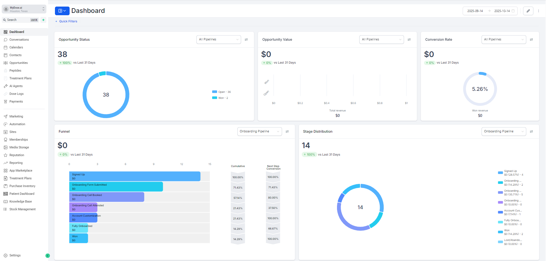
4. Top-Level KPIs (Opportunity Status, Value, Conversion Rate)
High-level snapshot of pipeline health and revenue potential.
➤ Opportunity Status
- Shows total opportunities (e.g., 38)
- Donut chart: Open (36) vs Won (2)
- % change vs last 31 days
➤ Opportunity Value
- Total revenue potential ($0 currently)
- Bar graph shows value distribution across deal sizes
- Tracks “Won” vs “Open” value
➤ Opportunity Rate
- % of opportunities converted to won deals (5.26% here)
- Formula: (Won Revenue ÷ Total Pipeline Value) × 100
- Visualized as a donut chart with “Won revenue” label
Use Case: Leadership uses these to assess overall business momentum and forecast revenue.
5. Funnel Visualization
Shows lead progression through each stage of the onboarding process.
- Horizontal bar chart with stages:
- Signed Up -> Form Submitted -> Call Booked -> Call Attended -> Account Customization -> Fully Onboarded -> Won
- Each bar shows:
- Count of prospects
- Cumulative conversion rate
- Next-step conversion rate
- Hover to see exact numbers
Use Case: Identify drop-off points. e.g., if 80% book calls but only 37.5% attend, improve reminder systems.
6. Stage Distribution (Donut Chart)
Visualizes how many prospects are in each stage at a glance.
- Donut chart with color-coded slices
- Legend on right shows:
- Stage name
- Value ($0)
- % of total
- Count (e.g., “Signed Up - 4”)
- Total count displayed in center (14)
Use Case: Quickly spot bottlenecks. e.g., too many stuck at “Account Customization” may indicate UI/UX issues.
7. Tasks & Manual Actions
Tracks pending work and manual outreach efforts.
➤ Tasks
- Filters: Pending / Due Date / Assignee
- Shows “No Data Found” if none assigned
- Great for daily standups or manager check-ins
➤ Manual Actions
- Tracks phone/SMS outreach
- Totals: Phone (0), SMS (0), Total Pending (0)
- Link: “Go to Manual Actions” -> takes you to full log
Use Case: Ensure no leads fall through the cracks; measure team activity beyond automated systems.
8. Lead Source Report
Breaks down where your leads are coming from and how they convert.
- Table with columns:
- Source (e.g., “discovery call”, “-” for unknown)
- Total Leads
- Total Values
- Open / Won / Lost / Abandoned
- Win%
- Pagination available for large datasets
Use Case: Double down on high-performing channels (e.g., discovery calls have 7.69% win rate).
9. Marketing & Ad Integration Reports
Displays performance data from connected marketing platforms.
➤ Google Analytics Report
- Shows traffic trends over last 12 months
- Metrics: Total Visitors, Page Views, Direct/Paid/Social/Organic Views
- Currently “No Data Found” needs GA connection
➤ Google Business Profile
- Last 30 days: Total views, searches, maps clicks, conversations, bookings, calls
- Helps local clinics track foot traffic and engagement
➤ Facebook Ads & Google Ads Reports
- Total Clicks, Spend, CPC, CTR
- Shows ROI per platform
- Currently empty needs ad account integration
Use Case: Measure marketing ROI, optimize ad spend, and align campaigns with sales outcomes.
10. Sales Efficiency Metrics
Measures how fast and effectively your team closes deals.
Metrics:
- Average Sales Duration: 3D 2H (how long it takes to close a deal)
- Total Sale Value: $0 (current revenue generated)
- Sales Velocity: $0/M (monthly revenue per sales rep or team)
Use Case: Track team performance, set benchmarks, and identify training needs.